Upgrading .NET MAUI Android Apps to Material 3: A Comprehensive Guide
| Shelf | AI & ML |
|---|---|
| Date in | |
| Readers | 748 |
Learn how to enable Material 3 in your .NET MAUI Android apps, explore its new features, and understand the current limitations for future enhancements.
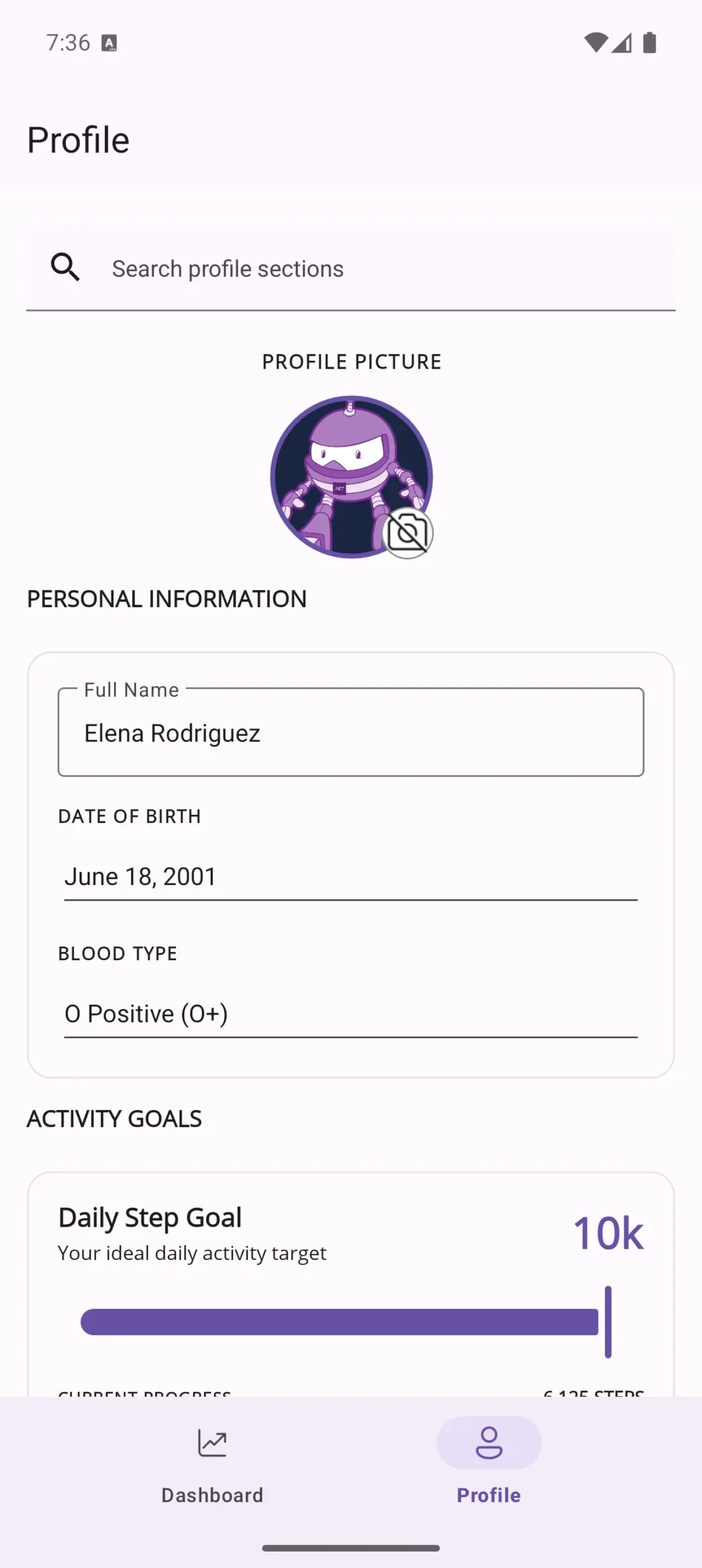
With the release of .NET MAUI 10, developers can now upgrade their Android applications to use Material 3 (also known as Material You) styling with just a single adjustment in the MSBuild property. This transition offers a fresh design that aligns with the latest Android aesthetics and user preferences. Currently, several controls support this styling, with more expected in upcoming service releases. Eventually, the goal is to standardize Material 3 as the default styling for Android applications.
Understanding Material 3
Material 3 is the latest evolution of Google's Material Design framework, distinguishing itself from Material 2 through several key features:
- Dynamic Color Schemes: Material 3 allows applications to adopt color themes that adjust according to user preferences and system settings.
- Redesigned Components: It presents updated shapes, elevation profiles, and focus states for controls.
- Enhanced Customization: Developers benefit from greater flexibility using Material's color tokens for personalized styling.
By default, .NET MAUI Android apps will continue with Material 2 styling unless the new property is enabled, thereby ensuring compatibility while providing an option for a more contemporary look.
Note: Currently, Material 3 support is exclusive to Android within .NET MAUI. iOS, Mac Catalyst, and Windows maintain their respective native design systems.
How to Enable Material 3
To utilize Material 3, your .NET MAUI project must be updated to target net10.0-android or a related framework version.
This feature has been progressively integrated through various service releases. It commenced with basic styling in SR3 (version 10.0.30), a checkbox implementation in SR4 (10.0.40), and the most significant updates—Button, Entry, SearchBar, DatePicker, Slider, ProgressBar, ImageButton, Switch, and Shell theming—were delivered in SR6 (10.0.60).
To achieve the complete Material 3 experience, ensure your project uses the latest version (10.0.60 or later) of the Microsoft.Maui.Controls NuGet package.
Activating Material 3 is straightforward: open your project’s .csproj file and introduce the following property within a <PropertyGroup>:
<PropertyGroup>
<UseMaterial3>true</UseMaterial3>
</PropertyGroup>
After rebuilding the app, deploy it on an Android device or emulator, and the applicable controls will automatically adopt the Material 3 styling. This process does not necessitate custom handlers or modifying style resources.
It's important to note that enabling Material 3 affects only the default appearance. Any previously defined styles or colors in your XAML or C# (like BackgroundColor or TextColor) will still take precedence, maintaining your app's branding. If you wish to revert to Material 2 styling, simply remove the <UseMaterial3> property or set it to false.
Visual Enhancements with Material 3
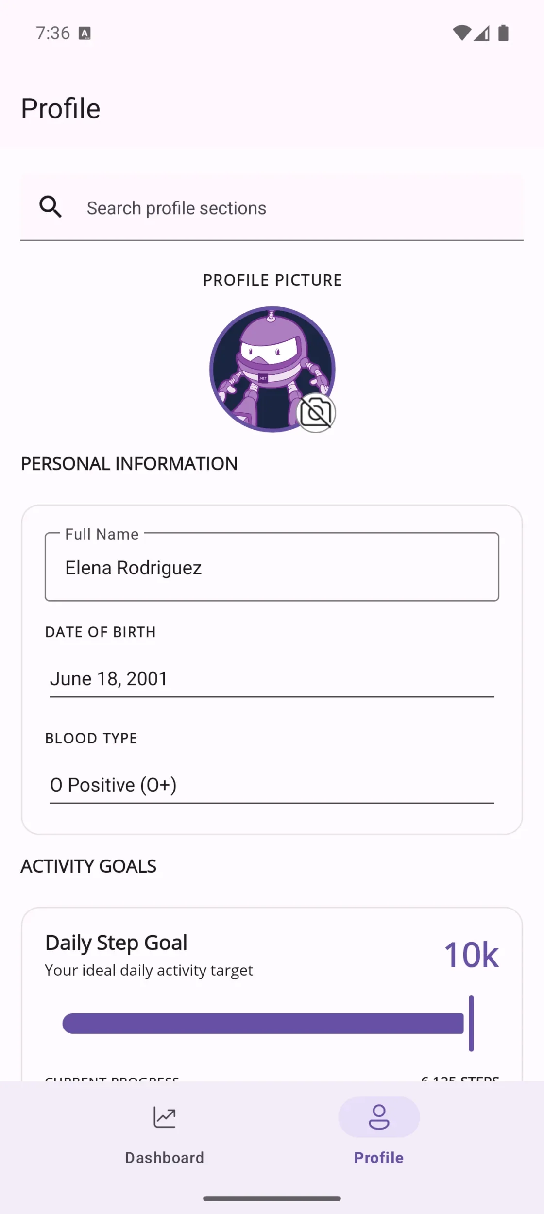
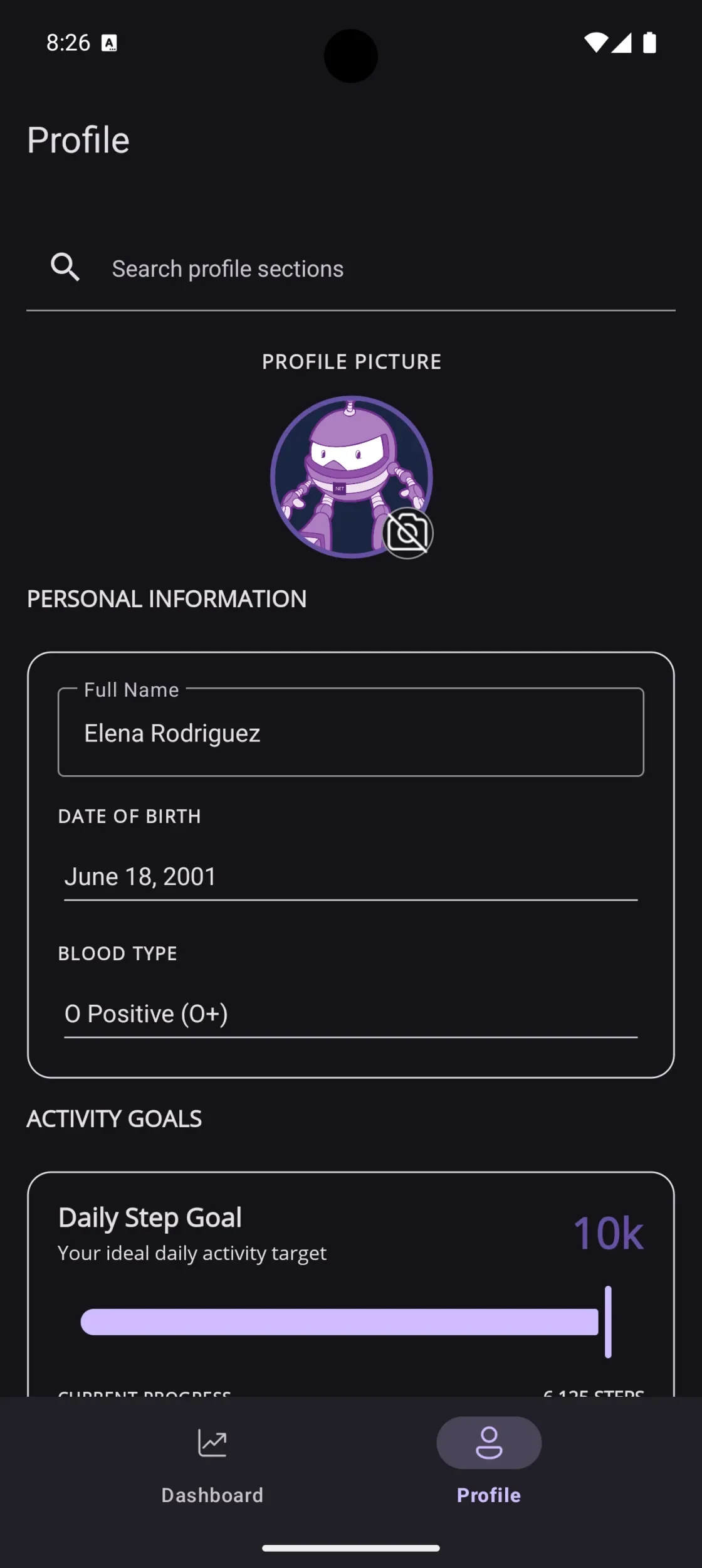
The Material 3 demo conveys the immediate visual benefits—illustrating updates under both light and dark themes across essential controls, such as SearchBar, Entry, and DatePicker. The significant modifications involve:
- Entry & Editor: Transitioning from the traditional underlined
EditTextto an outlinedTextInputLayoutcomplemented by a floating label. - SearchBar: A revamped inline text field integrated with a search icon and a clear button.
- DatePicker: Replacing the old spinner-style dialog with a full-screen calendar overlay.
- TimePicker: Incorporating a Material 3 clock dial, aligned with the dynamic color scheme.
- Slider: Featuring a newly designed track and thumb mechanism.
- ProgressBar: Utilizing Material 3’s redesigned
LinearProgressIndicator. - RadioButton & Picker: These components automatically adopt Material 3's color roles and visual feedback.
For further exploration of design disparities between Material 2 and Material 3, the official documentation provides valuable side-by-side comparisons.
Current Limitations
The initial release focused on controls where the visual impact of switching to Material 3 was most pronounced, necessitating updates to handler implementations. Supported controls include the Entry, Editor, SearchBar, Picker, RadioButton, TimePicker, DatePicker, Switch, ProgressBar, ActivityIndicator, Slider, Image, ImageButton, Button, and CheckBox.
Other controls, such as Stepper and CollectionView, can leverage Material 3 colors via the overall Android theme but lack specific Material 3 handler implementations for now.
Key areas for further development include:
- The ability to opt-in control styling individually, rather than applying Material 3 globally across the application.
- Dynamic color token access through .NET MAUI APIs, which is currently unavailable.
- Restyling of navigation controls and collection views, which haven't been prioritized yet.
The expectation is for Material 3 to evolve into the default Android styling once these enhancements are realized. For ongoing updates, tracking issues are available on GitHub.
Encouragement to Engage
This feature thrives on feedback from real-world applications. Developers are encouraged to implement Material 3 in their apps and report any discrepancies or enhancement requests encountered during testing. Here’s how to participate:
- Incorporate
<UseMaterial3>true</UseMaterial3>into a branch of your project. - Conduct tests across various Android API levels, with a focus on versions where Material You is most effective.
- Report any issues through the .NET MAUI repository, providing screenshots and examples where possible.
Whether you encounter issues or everything functions seamlessly, sharing your experiences helps refine the platform for future users.
The transition to Material 3 in .NET MAUI 10 represents a significant advancement for Android app aesthetics, requiring minimal effort for substantial rewards. Take the leap, provide feedback, and help shape the look and feel of .NET MAUI applications moving forward.
References
- Documentation for .NET MAUI Material 3
- Material 3 sample for .NET MAUI
- Components of Material Design 3
- .NET MAUI Repository on GitHub
The original post can be found here.