Creating Responsive Typography with CSS: Beyond Media Queries
| Shelf | AI & ML |
|---|---|
| Date in | |
| Readers | 967 |
This guide discusses modern CSS techniques for responsive typography, emphasizing fluid designs that enhance readability without relying on numerous media queries.
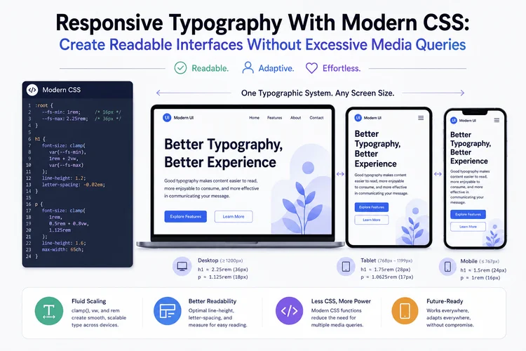
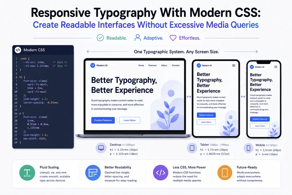
Typography profoundly affects web design, influencing readability, visual hierarchy, accessibility, and overall user experience. Managing responsive typography, however, poses challenges when developers depend on fixed font sizes and a multitude of media queries. For instance, what works well on a desktop might not translate effectively to mobile. Modern CSS offers tools to create flexible typography that adapts to available space while minimizing repetitive code. This article explores essential practices for implementing responsive typography without compromising on readability or accessibility.
Why Fixed Font Sizes Can Be Limiting
Using fixed font sizes can be practical but has its downsides. For example, a traditional CSS stylesheet may specify various heading sizes for different viewport widths:
.page-title {
  font-size: 2rem;
}

@media (min-width: 48rem) {
  .page-title {
    font-size: 2.75rem;
  }
}

@media (min-width: 75rem) {
  .page-title {
    font-size: 3.5rem;
  }
}
This approach, while valid, results in abrupt size changes at breakpoints, leading to a less adaptive feel. A more effective strategy involves allowing text to scale fluidly within a defined range.
Use clamp() for Fluid Typography
The CSS clamp() function is crucial for fluid typography. It lets you set a minimum, a preferred size, and a maximum:
.page-title {
  font-size: clamp(2rem, 1.2rem + 3vw, 3.5rem);
}
This functionality allows the browser to calculate a size based on viewport width while remaining within defined limits. The arguments serve specific purposes:
2remsets the minimum font size.1.2rem + 3vwprovides a fluid calculation for the preferred size.3.5remdefines the maximum size.
Without these limits, font sizes could become excessively small on narrow screens or unnecessarily large on wide displays. Test different sizes to find the balance that best suits your content and design.
Build a Consistent Typography System
To enhance consistency, leverage a small set of reusable typography rules instead of applying clamp() individually:
:root {
  --text-body: 1rem;
  --text-small: 0.875rem;
  --text-heading-sm: clamp(1.25rem, 1.1rem + 0.6vw, 1.75rem);
  --text-heading-md: clamp(1.75rem, 1.4rem + 1.5vw, 2.5rem);
  --text-heading-lg: clamp(2rem, 1.2rem + 3vw, 3.5rem);
}

body {
  font-size: var(--text-body);
  line-height: 1.7;
}

h1 {
  font-size: var(--text-heading-lg);
}

h2 {
  font-size: var(--text-heading-md);
}

h3 {
  font-size: var(--text-heading-sm);
}
This creates a foundation for your typography that can easily adapt to design changes without needing to modify multiple selectors. Your typography scaling should align with the content and layout, tailoring it to your users’ needs.
Improve Readability With Relative Units
Using relative units, notably rem, helps the typography respond well to user settings and surrounding styles. This unit bases size on the root element's font size, creating consistent scaling:
body {
  font-size: 1rem;
}

.article-content {
  font-size: 1.125rem;
  line-height: 1.75;
}

.article-content h2 {
  margin-block-start: 2em;
  margin-block-end: 0.5em;
}
Responsive typography requires testing against various conditions, as comfort levels depend on typeface choice, line length, and user preferences. Consider the implications of browser zoom and increased text size on your design.
Control Line Length for Comfortable Reading
A crucial aspect of readability is controlling line length. Text that spans an entire desktop screen can confuse readers. Using the max-width property can optimize line length and spacing:
.article-content {
  max-width: 68ch;
  margin-inline: auto;
  padding-inline: 1rem;
}
Here, the ch unit helps control text width based on a fixed character width. This setup maintains central reading space while adapting to smaller devices, ensuring that long lines don’t hinder readability.
Combine Fluid Typography With Responsive Layouts
Typography should work alongside layout. To enhance this relationship, utilize container queries that allow typography to adapt per component rather than aligning strictly with viewport size:
.feature-card {
  container-type: inline-size;
}

.feature-card__title {
  font-size: 1.5rem;
}

@container (min-width: 32rem) {
  .feature-card__title {
    font-size: 2rem;
  }
}
Container queries adjust elements dynamically within their context, making them ideal for reusable components and content that shifts across different layouts. Maintain the content hierarchy to improve reading conditions.
Respect Accessibility and User Preferences
A truly responsive typography system respects user preferences for text enlargement, ensuring that layouts remain user-friendly whether or not users zoom in. Avoid fixed-height containers and restrictive overflow rules that can hinder accessibility:
.heading-animation {
  animation: slide-in 500ms ease-out;
}

@media (prefers-reduced-motion: reduce) {
  .heading-animation {
    animation: none;
  }
}
By testing for keyboard navigation, browser zoom levels, contrast, and heading hierarchy, you ensure that content remains accessible.
Common Mistakes to Avoid
Even the best-designed systems can fail if not tested thoroughly. Here are common pitfalls:
- **Using viewport units alone:** This can lead to inconsistent text sizes. Firmly mix fluid values with logical maximum and minimum limits.
- **Applying the same scale everywhere:** Consider the context; large headings have different needs than smaller labels.
- **Ignoring content length:** Always test with realistic content, rather than placeholders.
- **Using excessive breakpoints:** Only add media queries for substantial layout changes, not minor size adjustments.
- **Restricting text containers:** Ensure layouts allow content to grow naturally instead of being confined within fixed heights.
- **Skipping browser testing:** Verify CSS behaviors across all relevant browsers and devices.
Conclusion
Creating responsive typography transcends merely selecting smaller fonts for mobile. It necessitates a system that balances flexibility, readability, and accessibility. Utilizing tools like clamp(), relative units, and container queries can greatly enhance the adaptability of typography in web design. By harmonizing fluid sizing with thoughtful layout control, developers can streamline their styles while catering to the varied experiences users encounter across devices.