Master Dark Mode in CSS: Simplify User Preferences with `light-dark()` Functionality
| Shelf | AI & ML |
|---|---|
| Date in | |
| Readers | 929 |
Learn how to effectively implement dark mode in CSS with the `light-dark()` function, reducing complexity and enhancing user experience.
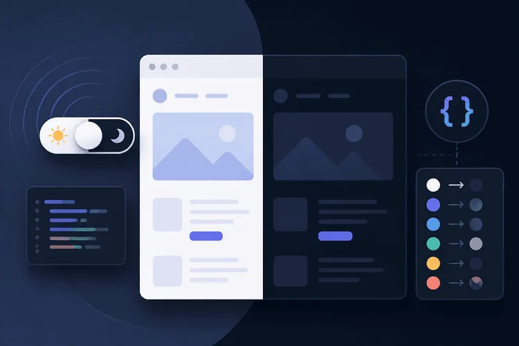
Mastering Dark Mode in CSS: A Practical Guide
Dark mode isn't just a trend; it's now a fundamental design expectation across platforms. However, implementing it using straightforward CSS and JavaScript can still throw even seasoned developers for a loop. The common pitfalls, such as the “flash of wrong theme” (FOUC) during page loads and the messy media query clutter in stylesheets, continue to plague many. If you’re in this space, you’ve likely faced issues ranging from properly remembering user preferences to executing CSS that adapts to those preferences without a hitch. The CSS `light-dark()` function, which is now supported in major browsers like Chrome, Firefox, and Safari, changes the game. Unlike prior methods, which required cumbersome duplication of color declarations to support light and dark themes, `light-dark()` simplifies things significantly. This guide introduces a no-flash, pure CSS and JavaScript dark mode toggle that honors user settings, utilizes the `color-scheme` property effectively, and employs local storage for persistent user choices. Moreover, it embraces a progressive enhancement strategy to achieve compatibility with browsers lacking the latest CSS features.Table of Contents
- The Ongoing Challenges of Dark Mode Implementation
- Understanding `color-scheme` and `light-dark()` Functions
- Laying the Groundwork with HTML
- Creating a CSS Token System
- Avoiding Theme Flash Using an Early Load Script
- Incorporating User Control with Local Storage
- Debugging Dark Mode
- Integrating All Components
- Future Implications of This Approach
Challenges in Creating Dark Mode
Despite the growing expectation for dark mode capabilities, developers still encounter roadblocks when trying to implement them with CSS and JavaScript. The flash of wrong theme (FOUC) happens when a page loads and shows the incorrect theme before JavaScript kicks in to set a user preference. Issues like duplicated media queries and the need for persistence logic complicate the build process, requiring additional effort to ensure the user's chosen theme is retained. The arrival of the `light-dark()` function provides a much-needed solution. It’s now possible to build a no-flash dark mode toggle that aligns with system preferences while also utilizing local storage to keep user choices intact. This tutorial streamlines the process by using CSS variables, allowing for a significant reduction in the complexity of writing color declarations.How `color-scheme` and `light-dark()` Work Together
Understanding `color-scheme`
To signal to the browser that your page supports multiple color schemes, you should set the `color-scheme` property on the `:root` element. This isn't just a recommendation; it directly influences how essential UI elements such as form controls and scrollbars are rendered. By declaring `color-scheme: light dark`, for example, the browser will adjust its UI elements according to the user's system preference.Explaining the `light-dark()` Function
The `light-dark()` CSS function takes two parameters and returns a value based on the active color scheme. If light is active, it returns the first value; if dark, the second. This approach effectively reduces duplicative code, offering a more efficient way to manage themes compared to the previous methods that required extensive overrides within `prefers-color-scheme` media queries. In conclusion, the latest techniques and functions, such as `light-dark()`, promise to simplify your development process. By understanding these tools and how they interconnect, you can deliver an elegant dark mode experience that respects user preferences without compromising performance.Crafting a Functional CSS Token System
Understanding Design Tokens through light-dark()
At the heart of an effective dark mode implementation lies a well-structured custom-property token map. This is declared in the :root selector, where each token cleverly uses light-dark() to represent both light and dark theme values in a single line. By employing the oklch color model for these definitions, we achieve a high degree of perceptual consistency; this means that variations in lightness are more intuitively applied across different themes compared to older color formats like hsl or hex. That said, hsl and hex remain valid options for use with light-dark().
This token map not only serves as a core deliverable of the dark mode CSS variables architecture, but it also lays the groundwork for any design system you might be developing.
Important Note: Utilizing light-dark() necessitates appropriate support, so ensure that you're familiar with relevant fallbacks. For complete progressive enhancement strategies, check out Code example 6. Also, be aware that light-dark() accepts only <color> values; you'll need to manage shadow values separately using data-theme selectors or media queries.
Utilizing Tokens in Components
Components can integrate these tokens without needing to understand which theme is currently active. This removes the complexities of media queries or theme-specific logic, resulting in a cleaner architecture. Essentially, all the complexity of switching themes is relegated to the token layer, allowing for smoother transitions. Keep in Mind: If a previously stored theme is applied through the script during initial page load, thetransition on body will animate. Refer to the initialization instructions in the Toggle Script section for information on suppressing this effect.
Applying the Token Map—Look at the CSS
The following example shows how to implement these tokens in a set of component styles effectively: ```css /* Code example 5 — Component styles utilizing tokens */ /* Disable transitions during theme initialization */ .no-transition, .no-transition * { transition: none !important; } body { background-color: var(--color-surface-1); color: var(--color-text-primary); font-family: system-ui, sans-serif; line-height: 1.6; transition: background-color 0.2s ease, color 0.2s ease; } .card { background-color: var(--color-surface-2); border: 1px solid var(--color-border); border-radius: 8px; padding: 1.5rem; box-shadow: var(--shadow-elevation-1); } .card h2 { color: var(--color-text-primary); margin-top: 0; } .card p { color: var(--color-text-secondary); } .btn-primary { background-color: var(--color-accent); color: var(--color-accent-text); border: none; border-radius: 6px; padding: 0.6rem 1.2rem; cursor: pointer; font-weight: 600; } header { background-color: var(--color-surface-3); padding: 1rem 2rem; border-bottom: 1px solid var(--color-border); } header nav { display: flex; justify-content: space-between; align-items: center; } footer { color: var(--color-text-muted); text-align: center; padding: 2rem; } ``` This structure encourages a strong separation of concerns, keeping your styles clean and accessible across multiple themes.### Optimizing Dark Mode Compatibility Ensuring consistent dark mode support across various browsers can be challenging, especially with legacy versions lacking the latest CSS specifications. Browsers such as pre-2024 Chrome, Firefox, and Safari do not support the `light-dark()` function, resulting in custom properties defaulting to invalid values and leading to unintended styling issues. This becomes more than a mere technical detail; it affects the overall user experience significantly. To navigate this inconsistency, the effective workaround involves encapsulating `light-dark()` tokens within an `@supports` rule. This way, browsers that don’t recognize `light-dark()` can fall back on `prefers-color-scheme` media queries, allowing them to exhibit a fully functional dark mode using more traditional CSS without sacrificing modern styling benefits. Here's the key takeaway: while newer browsers can take advantage of the streamlined `light-dark()` syntax, older models won’t be left in the dark literally or figuratively. By tailoring fallback styles with supported color formats, you can ensure that even outdated browsers deliver a satisfactory user experience. Bear in mind that specific properties, like `oklch()` or `lch()`, might not be compatible with browsers lacking support for `light-dark()`. Sticking to basic color formats in your fallback styles is crucial to avoid pitfalls. If you’re working in this space, keep these considerations at the forefront of your design strategy. ### Looking Ahead: A Seamless Experience Anticipating the browser landscape's evolution, it’s likely that broader adoption of features like `light-dark()` will emerge, especially as user preferences shift towards more personalized themes. Nevertheless, ensuring backward compatibility is essential for a sizable portion of users still on legacy browsers. The workarounds now in place highlight a transition period in web development, steering clear of accessibility pitfalls while catering to diverse user needs. Ultimately, implementing these best practices isn't just about adapting to current standards; it's about preparing for a future where user experience is at the core of design strategy. Enhanced functionality like this could become a standard expectation rather than a bonus, pushing developers to continually refine how themes are applied across various platforms.