Harnessing CSS Container Queries for Adaptive Component Design
| Shelf | AI & ML |
|---|---|
| Date in | |
| Readers | 543 |
CSS container queries enable developers to create responsive components that adapt to their surrounding layout, improving flexibility and reusability.
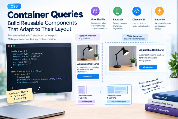
Responsive web design has long been anchored in the use of media queries that adapt layouts based on viewport dimensions. While effective for larger structural changes, this approach has significant limitations, particularly when similar components are deployed across diverse layouts. Take, for instance, a product card that appears on a desktop product page, within a narrow sidebar, and on a mobile shopping interface. Despite identical browser sizes, these contexts offer varied available space, making viewport-centric media queries inadequate.
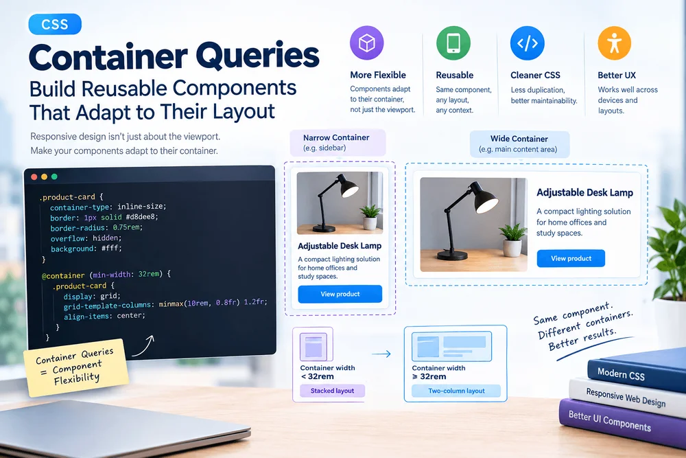
This is where CSS container queries come into play, offering a novel and more flexible approach. By enabling components to adjust in response to their container's dimensions rather than the viewport, these queries significantly streamline responsive design for reusable interfaces and cut down on repetitive component-specific CSS.
Decoding CSS Container Queries
To grasp the fundamental difference, it’s important to understand how media queries and container queries operate. Media queries judge conditions like viewport width, user settings, or device capabilities, while container queries focus on the size of a specified parent container.
This distinction proves crucial in constructing reusable UI components. Rather than questioning whether the screen size is adequate, a component inquires if the space available to it is suitable for its layout. To implement container queries, developers must first designate a query container using the container-type property.
.product-card {
  container-type: inline-size;
}
The inline-size value allows the component to observe the available width for any horizontal writing modes. Once established, descendants of the container can adapt their styles based on the container's dimensions.
@container (min-width: 32rem) {
  .product-card__content {
    display: grid;
    grid-template-columns: 8rem 1fr;
    gap: 1rem;
    align-items: center;
  }
}
In this case, when the container's width reaches a minimum of 32 rems, the content layout changes to a two-column format, maintaining compactness in narrower contexts, such as sidebars or mobile views.
Creating a Responsive Product Card
A practical example to illustrate this concept is the product card, frequently appearing in various layouts. To build it, start with semantic HTML structure.
<article class="product-card">
  <img class="product-card__image" src="/images/desk-lamp.jpg" alt="Adjustable desk lamp" width="480" height="320">
  <div class="product-card__content">
    <h2 class="product-card__title">Adjustable Desk Lamp</h2>
    <p class="product-card__description">A compact lighting solution for home offices and study spaces.</p>
    <a class="product-card__link" href="/products/desk-lamp">View product</a>
  </div>
</article>
The <article> tag denotes a discrete item, bolstered by a meaningful hierarchy that enhances navigation. Following this structure, define a default layout optimized for narrower spaces.
.product-card {
  container-type: inline-size;
  border: 1px solid #d8dee8;
  border-radius: 0.75rem;
  overflow: hidden;
  background: #fff;
}
This configuration allows the image and text to stack vertically, suitable for compact layouts. With a container query, the card's layout can switch to horizontal when conditions allow for more space.
@container (min-width: 32rem) {
  .product-card {
    display: grid;
    grid-template-columns: minmax(10rem, 0.8fr) 1.2fr;
    align-items: center;
  }
  .product-card__image {
    height: 100%;
    aspect-ratio: auto;
  }
}
This setup provides two layout versions without necessitating separate HTML for various devices, ensuring consistency in design.
Container Queries vs. Media Queries
While both container queries and media queries address responsiveness, they do so in different contexts. Media queries are the go-to when the entire page needs to adjust in relation to viewport size. In contrast, container queries excel when individual components must adapt to their immediate layout.
| Requirement | Recommended Approach |
|---|---|
| Change the main navigation on smaller screens | Media query |
| Adapt a reusable card to its parent width | Container query |
| Change page-wide spacing at a breakpoint | Media query |
| Adjust a widget inside a dashboard panel | Container query |
| Respond to reduced-motion preferences | Media query |
Utilizing both techniques can often result in a clearer implementation. For instance, a media query can reshape the overall dashboard layout while container queries adjust specific cards according to their panels' dimensions.
Named Containers for Enhanced Control
In scenarios involving multiple nested containers, named queries can add clarity. This is particularly beneficial in large projects where various components overlap.
.dashboard-panel {
  container: dashboard-panel / inline-size;
}

@container dashboard-panel (min-width: 40rem) {
  .dashboard-panel__content {
    grid-template-columns: 1fr 1fr;
  }
}
The container property assigns both a name and the type of query, facilitating easier management of complex structures and minimizing the risk of accidentally modifying an unintended parent container.
Avoid Common Pitfalls
Implementing container queries is straightforward but can yield unexpected results through a few common oversights:
- Neglecting to establish a container: A size query without a designated container will not apply relevant styles.
- Over-reliance on viewport breakpoints: This can tie reusable components unnecessarily to overall layout decisions.
- Assuming every CSS property is queryable: Familiarize yourself with supported features to avoid misusing container queries.
- Ignoring fallback layouts: Ensure components have a functional base layout before enhancing with queries.
- Complicating responsive rules: More breakpoints don't always equal better design; adjust layout only when required.
Testing for Compatibility and Real-world Usage
Although container queries are supported in modern browsers, thorough testing remains paramount. Use resources like Can I Use to outline browser compatibility and verify functional integrity in actual layouts.
A solid testing strategy includes manipulating parent containers independently of the viewport, assessing various text lengths, and scrutinizing how images and controls behave at varying widths. Testing components in differing contexts is critical to gauge compatibility effectively.
Conclusion
CSS container queries present a pragmatic approach for creating components tailored to the specific space they occupy, especially engaging for product cards, dashboard widgets, and content blocks that must function across dynamic page contexts. The best practice involves merging media queries for broader viewport considerations with container queries for refined, component-level responsiveness. Thus, with well-structured HTML, sensible default styles, and rigorous testing, developers can construct adaptable interfaces that are both efficient and maintainable. Container queries don’t single-handedly resolve all responsive design challenges, but they empower developers to tackle many using native CSS.